Being able to capture and analyse the data from standardised tests such as NAPLAN, ACER and Allwell has become, in effect, table stakes for all analytics companies working with K-12 schools. Getting the data and pulling it together is easy enough and visualising it in conditional categories which breaks down performance in terms of meeting or exceeding expectation is also fairly straightforward. This all reflects what schools would have done manually. Analytics software that automates this process saves a school a lot of time in manual effort, but in stopping there, analytics fails to truly address what teachers want to know next.
Working with our schools and having them really push us and what we're doing with NAPLAN, ACER and Allwell data to better underpin their lesson planning has been instrumental. So, cutting to the chase... what should we be analysing?
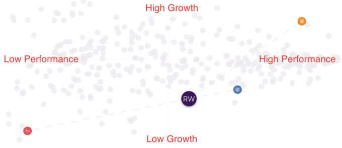
Aptitude vs Achievement
Standardised tests provide us with an indication of a student's capability at a point in time, measuring the skills they need to succeed as students and in life more generally. Teacher judgements and measures of achievement are an assessment of a student's ability to respond critically to a body of content that has been studied. The two are different but complementary in that can help us understand if a student is meeting their potential.
The figure below illustrates the Domain achievement and growth results for one student, for PAT Numeracy (yellow), NAPLAN's Numeracy (blue) and the achievement results for the subject Mathematics.
- The PAT Numeracy result indicates a high scaled score and significant improvement since the last PAT Numeracy test.
- The NAPLAN Numeracy result indicates a moderately high scaled score and a drop in performance since the last NAPLAN test.
The Mathematics subject score indicates that while this student has demonstrated aptitude in numeracy-related skills in standardised tests, this is not translating to strong achievement scores in Maths. Why is that?
Zone of Proximal Development
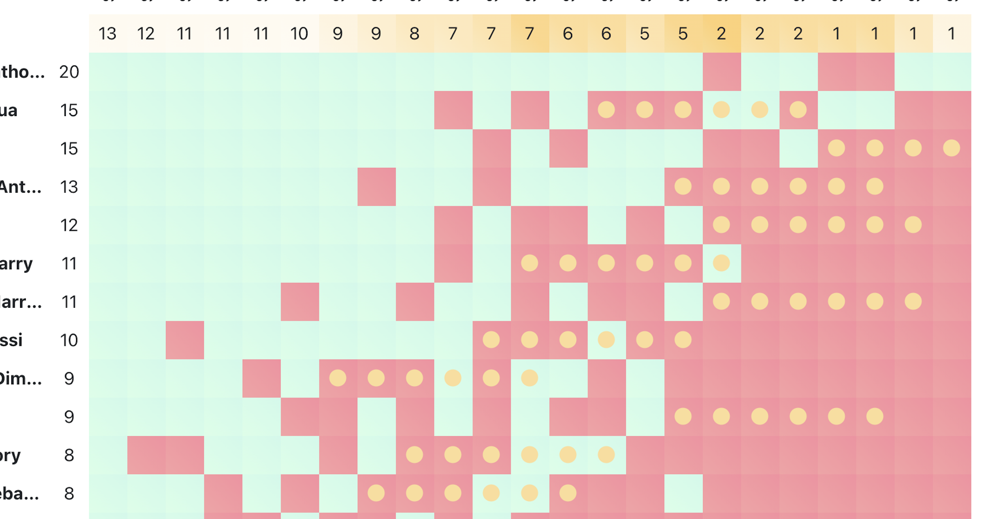
Knowing a student has aptitude is certainly useful for planning but to truly differentiate instruction and assessment, we need to see more clearly where their strengths and challenges sit within each strand of the domain. Enter Vygotsky's (remember him from the second year of your teaching degree?) Zone of Proximal Development (ZPD). A critical aspect of Vygotsky's theory of learning is that notion that we can support student growth by identifying the space between what a learner can do unsupervised and what a learner can do with teacher guidance. In practical terms, this is the point at which a student starts to get more questions wrong than right during a standardised test like NAPLAN.
The image below is an example of a Guttman chart produced automatically in our analytics. It helps teachers identify their students' ZPD and to see the specific skills they could target to individual students or small groups in their lesson planning. Along the left (rows) is each student in the cohort a teacher is looking at. At the top (columns) is each question from the standardised test, described by the curriculum descriptor. Students are sorted by most correct answers to least and questions are sorted left to right by most frequently answered correctly, to least. We end up with a kind of diagonal where green meets red. This diagonal is an approximation of this class's ZPD, however, we've calculated each student's ZPD, as indicated by the gold dots. These are the skills, which under teacher-guided instruction, would constitute a 'stretch goal' for the student.
Growth Indicators
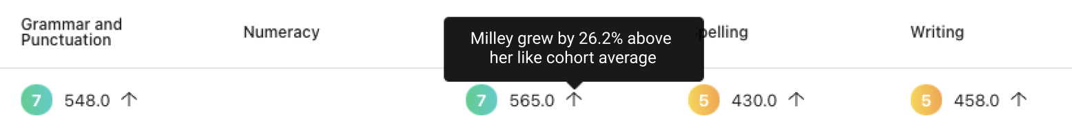
Standardised tests provide with their data sets, useful benchmarking information, against which student growth can be objectively measured. Whether it's the state mean, the national median or their classmates, looking at a student's rate of growth can be made more meaningful when it's framed by context.
We've found that exactly what 'context' should be used differs from school to school! In a recent conversation, we determined that 'cohort' and 'like starting point' were critical to understanding a student's rate of growth. By this we mean, a sub-set of students who took the same tests in 2019 and 2021 and whose 2019 scaled scores indicated that in that they were in the same band of performance. So it's limiting the comparison group to those who had 'like' scores to begin with.
This is illustrated below in that upon hover on the arrow for this 'Reading' scaled score, we see that Milley showed growth of 26% when compared to students who started with scores similar to hers in the previous test.
Making it Meaningful
Automating the process of getting, collating and visualising NAPLAN, ACER, and other standardised testing data has meant that teachers and school leaders spend less time data wrangling and more time asking great questions. We've worked with our schools to really nail down those questions and to take the extra necessary steps to analyse and visualise the data in the way that they need to see it to address individual student needs.
Why not get in touch and see if we can help you achieve your learning and teaching aspirations with better analytics?